CM SUPPLY Works NEW
Hand one
Hand injuries in healing
We were approached by doctors practicing in German hospitals to help reimagine patient care for hand injuries. Tasked with creating an innovative healthcare app, we took care of everything—from consulting and ideation to user research, wireframing, and collaboration with AR developers. Specializing in hand injury treatment, the app empowers doctors to remotely assess patients, prescribe treatments, and offer seamless care outside the hospital. Grasping—a key aspect of recovery—became the foundation of the design language. From motion and haptics to visual cues, typography, logo, and iconography, every detail was crafted to reflect this focus. Still in its MVP phase, the project is already receiving strong validation at startup events. Our contributions extended beyond the app, including pitch decks and a corporate communication package that amplified the doctors’ vision.
Mátyás Czél Natália Tímea Szabó, Dalma Habony

POV Budapest
Conference for Visual Practices
Budapest is a city of juxtapositions—where Secessionist facades stand beside Brutalist structures, where socialist-era typography still lingers on street signs, and where contemporary design constantly reshapes the past. It’s a place that never fully settles, always shifting between preservation and reinvention. In designing the identity for POV Budapest, we took a similarly free and subjective approach. In collaboration with COMET studio, we pulled from Hungarian design heritage intuitively, not systematically—allowing different eras to coexist without hierarchy. As a studio known for building systems, the challenge was to create something structured yet fluid, an identity that evolves just as the conference does. At its first event in 2024, POV Budapest welcomed 700 attendees from 50+ countries—a postcard from Budapest to the world. More than a project, this is our love letter to the city, written in the visual language that makes it what it is.
Mátyás Czél, Boldizsár Mátyás, Natália Tímea Szabó, Ádám Pusztai, Dalma Habony, Marcell Kazsik

Unito
Bring modular mindset to real spaces
Modular thinking translated into physical space
UNITO started from a digital idea: modular systems that you can endlessly rearrange—like widgets on a device—translated into a physical grid you can keep updating as life changes. We designed the project holistically: the product concept and system logic, the brand identity and narrative, and the full go-to-market layer—from communications to the website and image-making (including renders) that explain the system quickly. The design balances industrial clarity with human comfort: universal, characterful forms; friendly rounded details; and powder-coated, finely textured surfaces built for everyday use and long-term durability. Conceived as a platform rather than a fixed furniture line, UNITO’s early modules combine freely while “collections” act as inspiration—and the system is built to expand over time with new parts, spatial elements (like dividers), collaborations, and limited editions.

Verso
Look behind great art with legible pricing
The art market still runs on asymmetry—prices are hard to benchmark, comparable sales data is scattered, and collectors often spend days just to understand whether an asking price is fair. Verso was created to pull that curtain back, making sold-work data and pricing legible so people can navigate the market with more confidence. We designed Verso end-to-end: naming, brand identity, UI/UX, and motion behaviors—so the experience feels as immediate as saving a post, but as trustworthy as a research tool. The name mirrors the idea: verso is the “back side” of a work—the place where extra information lives, usually out of sight. Verso also brings social mechanics into collecting: users can save works they encounter, follow artists and galleries, and (over time) track how their own collection value changes. Under the hood, Verso ties artworks to verifiable details via an authentication tag/anchor that links the physical piece to a digital identity and visible provenance data—supporting long-term trust and transparency.

TAHL
Designer made website templates with intention
Designer-made Framer templates built for entrepreneurs. Each template offers a holistic, professional foundation that’s simple to alter, without the complexity of a custom build.

Freeeway
From SIM provider to IoT leader
Collaborating with moodley’s strategists, we helped streamline Freeeway’s message and reimagine their identity. Originally named for providing SIM cards for cross-border travel on Europe’s freeways before the roaming era, Freeeway’s roots inspired the design system. We used the long, continuous lines of freeway journeys as a core visual element—sometimes lifting them upward to highlight special moments for retail and public communication, while keeping them solid and grounded for B2B applications. This approach transformed Freeeway from a conventional SIM card provider into a dynamic, approachable partner, emphasizing their expertise in turning IoT tools into reliable revenue streams.
Render Network
The world’s largest distributed GPU rendering platform
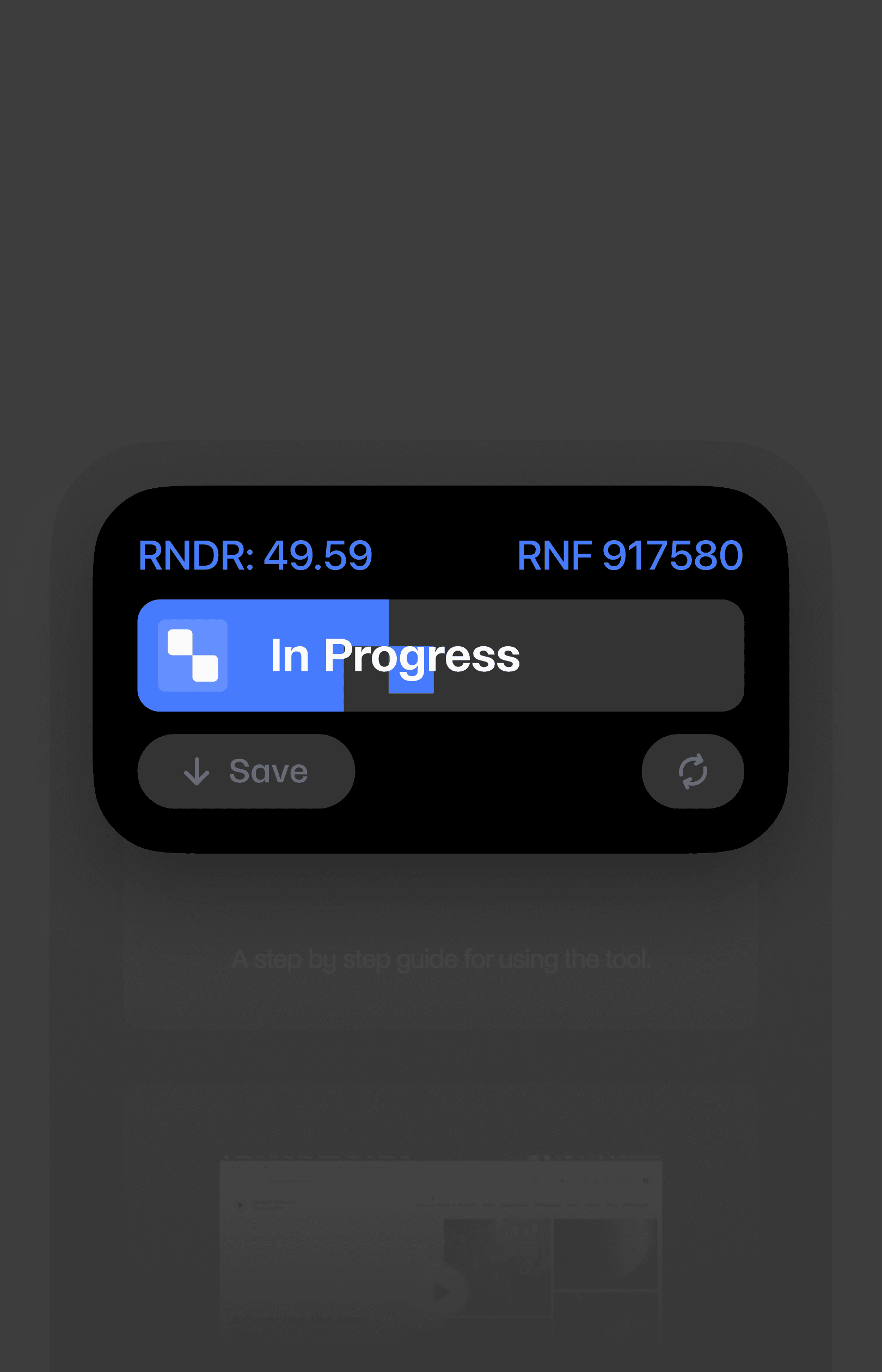
For nearly a year, we’ve partnered with the founders of Octane Render to develop a unified identity and interaction toolkit for the Render Foundation. Acting as an umbrella, the system seamlessly connects the foundation with the Render Network—the world’s largest decentralized GPU-based rendering platform, revolutionizing the digital creation process. The Render Foundation advances the next generation of rendering and AI technology, maintaining the Render Network protocol, growing its community, and enabling artists to scale intensive 3D work through an unprecedented peer-to-peer system. Even as render times decrease, we’ve built on the visual heritage of rendering itself—using the process as a foundation for the visual system, celebrating the transformation of raw compute power into creative output.
Mátyás Czél, Natália Tímea Szabó, Dalma Habony, Míra Magosi

Kazoda
Architecture is everything that is created space
Kazoda is an architecture studio that ventures across a diverse range of projects, from corporate environments and small-scale art collaborations to designing individual homes. Their work is characterized by an experimental, reflective, and environmentally conscious approach, with a strong focus on current housing challenges, natural retreats, and the art of creating spaces that are both simple and symbolic. We crafted a visual identity for Kazoda that simplifies the communication and cataloging of their multifaceted work. The design underscores their philosophy of treating every space they create as a work of architecture, providing a cohesive framework to represent their versatile and thoughtful projects.
Mátyás Czél, Natália Tímea Szabó, Dalma Habony
Render Network Foundation
New website
Natalia's lab
I creatively recharge myself through experimentation in my lab outside of client work.
UNITO
We bring our modular mindset to real spaces with our first physical product
We bring our modular mindset to real spaces with our first physical product

trppn
Share live music experiences
Visual system and app design for trppn building a decentralised creator economy
Trppn is a mission to shake up the music industry through a new decentralized community platform. Our task was to give their identity and app a fresh boost and create new ways for them to connect with their audience. We didn't want to create rules right away, so we decided to build a fun tool that let anyone to play around with the trppn look and feel. With vibrant colours and trippy visuals inspired by 90s rave scenes, we hope to inspire the creation of a fresh movement with new possibilities.
Mátyás Czél, Natália Szabó, Petra Erős
Mastory
Storyline Mathematics
Product design for Bill & Melinda Gates Foundation winner Mastory revolutionising math education
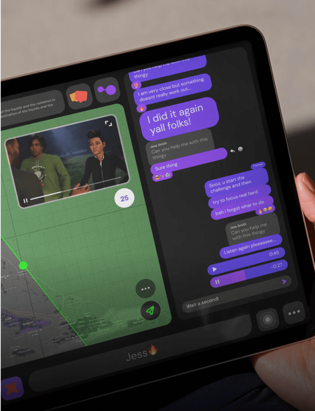
Mastory.io, a Bill & Melinda Gates Foundation grantee startup based in Germany and Hungary, approached us to create a cohesive brand identity across all aspects of user experience and communication. Their ultimate goal is to establish a democratic, student-centric educational system that caters to individual personalities, strengths, knowledge, backgrounds, and interests, rather than imposing a standardized approach. To achieve this vision, we embarked on a long-term partnership with Mastory.io, merging our team with their in-house developers to collaborate closely. We began with broad, low-fidelity concepts and iterated through every possible touchpoint, from high-level app layouts and user flows to iconography, motion principles, and communication styles. Rather than relying on traditional handover methods, we opted for an ongoing partnership that enables us to continually refine and evolve the design system while consulting with the Mastory team on a daily basis.
Mátyás Czél, Dániel Kozma, Natália Tímea Szabó